Look familiar?
Opportunities abound for some creative thinking and here is a round up of some of the best examples of creative online storytelling to inspire you.
So what are the trends in some of the new storytelling projects?
Larger Images: If you’ve spent some time on NPR, you’ll see large dominant images have taken over the top of story pages in many of their posts. The same is becoming true for many news outlets (I highly recommend checking out some of The Verge‘s projects) and it’s definitely true for the projects in this showcase.
Parallax Scrolling: An effect that is extremely popular right now, and used in most the projects listed below, you can see an example of great parallax usage on this Wired UK profile of Richard Branson.
Full Width Pages: Boxed formats are becoming a thing of a past and not a moment too soon I might add. Pretty much all of the projects listed below allow you to live within the story by abandoning the often-ignored sidebar in favor of a full screen experience.
White Space: Just because you can fit something into nearly every pixel on the screen doesn’t mean that you should. White space is beautiful and powerful.
Video: Not new necessarily, but you’ll see that the way video is being used is changing. It’s not just the video version of the text you’re reading, but rather a complimentary angle to the story that’s presented.
Scroll-based Events: In most of these stories, the user is also directing the presentation of the story with elements–video, animation, slideshows, etc.–that are triggered by the user’s location in the window or the speed that the user is scrolling at.
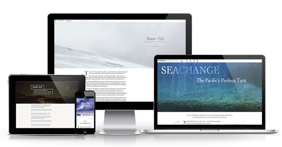
Snowfall: The Avalanche at Tunnel Creek
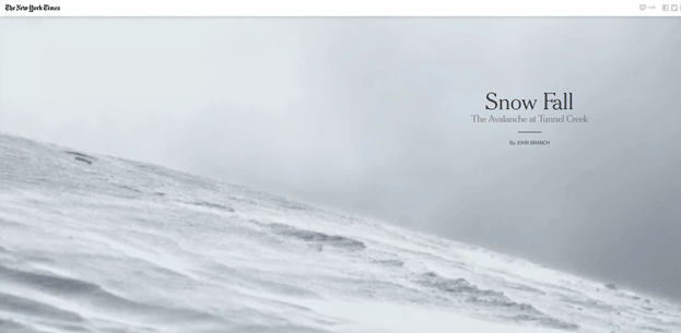
Snowfall is of course the current king of this style of storytelling online, even though the project launched nearly a year ago. The package picked up a ton of attention online, not to mention that Pulitzer. While the story is a pretty straightforward story of skiers caught up in an Avalanche in Washington State, the presentation was and still is pretty groundbreaking. #Snowfall started trending on Twitter, and became shorthand for doing this type of presentation. Read this behind the scenes piece if you want to learn more about how the team at NYTimes built Snowfall.
[/two_col_75_25_col1] [two_col_75_25_col2] Snowfall: The Avalanche at Tunnel CreekThe New York Times
December 2012
[/two_col_75_25_col2]
Fire Storm: The story of the bushfire at Dunalley

[two_col_75_25_col1]
Firestorm is a project from The Guardian that explains the circumstances behind a famous photo of a family sheltering under a dock during a raging fire in Australia. This interactive capitalizes on video and subtle sound to help the user place themselves in the scene. The story combines video, audio, maps and large photos to communicate the harrowing hours leading up to when the Holmes family abandoned their home to hide in the water when one of Australia’s largest fires headed straight for them.
[/two_col_75_25_col1] [two_col_75_25_col2] Fire Storm: The story of the bushfire at DunalleyThe Guardian
May 2013
[/two_col_75_25_col2]
The Jockey

[two_col_75_25_col1]
Another project from the New York Times, The Jockey is a profile of the “winningest” horse racing jockey in American history. The piece alternates between video and text broken up with beautiful photos. The piece is a lot less technically complicated than Snowfall was, but is still beautiful in it’s execution.
[/two_col_75_25_col1] [two_col_75_25_col2] The JockeyNew York Times
August 2013
[/two_col_75_25_col2]
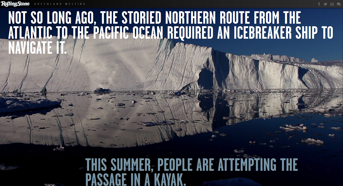
Sea Change: The Pacific’s Perilous Turn

[two_col_75_25_col1]
While not all stories, or even most stories, deserve this type of visual treatment, Sea Change is an excellent example of using graphics and video to help the audience understand a complicated scientific issue. Sea Change is about the growing threat of ocean acidification–a topic that can be hard to explain to the average joe. This project combines video, text, conversation forums and graphics. One of the best parts of the project is the excellent photography that showcases healthy habitat next to habitat affected by ocean acidification. Check out this behind the scenes piece on how the project was made.
[/two_col_75_25_col1] [two_col_75_25_col2] Sea Change: The Pacific’s Perilous Turn
The Seattle Times
September 2013
[/two_col_75_25_col2]
Leading up to Six:01 | Martin Luther King Jr. – The Last 32 Hours

Six:01 recounts the 32 hours leading up to Martin Luther King Jr.’s assassination. The project uses sophisticated graphics and an elegant timeline presentation that relays interviews with the people in King’s inner circle. Videos are small and unobtrusive but allow users to access deeper interviews. One thing that I particularly appreciated from this project is that in addition to the main story, there is also a pared down version of the timeline and a section of biographies that gives the reader more information on the sources from the story. For more info on the story, you can read this About Section for the reporter’s approach to the story.
[/two_col_75_25_col1] [two_col_75_25_col2] Leading up to Six:01 | Martin Luther King Jr. – The Last 32 HoursThe Commercial Appeal
April 2013
[/two_col_75_25_col2]
Tomato Can Blues

[two_col_75_25_col1]
Tomato Can Blues is a richly illustrated story of mixed martial arts fighting, crime, cheats and thieves. The piece keeps it simple with graphic novel style illustrations and a strong narrative style. The story is also available in an audio format read by Bobby Cannavale from Boardwalk Empire. It’s a compelling story with the illustrations triggered by the user’s scrolling. The effect is fun but not overly distracting. One criticism of the piece that was also applied to the Snowfall project is that while the story itself was beautifully designed and thought out, the same attention was not applied to the ads displayed with the story.
[/two_col_75_25_col1] [two_col_75_25_col2] Tomato Can Blues
The New York Times
September 2013
[/two_col_75_25_col2]
Thin Ice: Exploring Mount Hood’s Glacier Caves

Thin Ice is a captivating look at glacier caves on Oregon’s Mount Hood. The story utilizes a number of common elements from these projects–video, exceptionally photography, parallax scrolling and great storytelling. One difference though, is that OPB published additional stories and videos around the project rather than putting everything in one basket. There are other video clips on YouTube and additional stories on the OPB website. This is nice in that it gives the audience multiple points of access and the option of a more simplified story experience.
[/two_col_75_25_col1] [two_col_75_25_col2] Thin Ice: Exploring Mount Hood’s Glacier CavesOregon Public Broadcasting
October 2013
[/two_col_75_25_col2]
A Short History of the Highrise

[two_col_75_25_col1]
A Short History of the Highrise is an odd project in this bunch. It’s predominantly video in terms of the story experience. However, users have the options to opt out of the video to explore interactive features, however it requires a lot of clicking on the part of the user. It felt just a bit game-like, but without a real goal in mind. It’s certainly worth a look and some exploration. The project’s first three chapters are gleaned from NYT’s extensive visual archives and the final chapter is composed of user submitted images, which adds a welcome component of community participation that most of these projects lack.
[/two_col_75_25_col1] [two_col_75_25_col2] A Short History of the Highrise
The New York Times
October 2013
[/two_col_75_25_col2]
Greenland Melting
[two_col_75_25_col1]
Greenland Melting contains great visuals and good ideas. But, of all the projects, this one seemed the least refined. When I visited on multiple occasions, it appears there is a video or animation of some sort at the top of the page, but it’s permanently loading and I’ve yet to see it. The piece is marked with large pull quotes and large photos and tells the story of the scientists studying the rapid disappearance of Greenland’s glaciers. The graphics lack the finesse of the other projects, but there is merit in the overall design approach. I did love the video where the camera moves slowly past the glacier with large text overlaid, however the entry and exit from the video–again, it’s not as clean as it could have been. But, give it a chance and take a look. The story is good and the photos are nice.
[/two_col_75_25_col1] [two_col_75_25_col2] Greenland Melting
Rolling Stone
July 2013
[/two_col_75_25_col2]
Out in the Great Alone
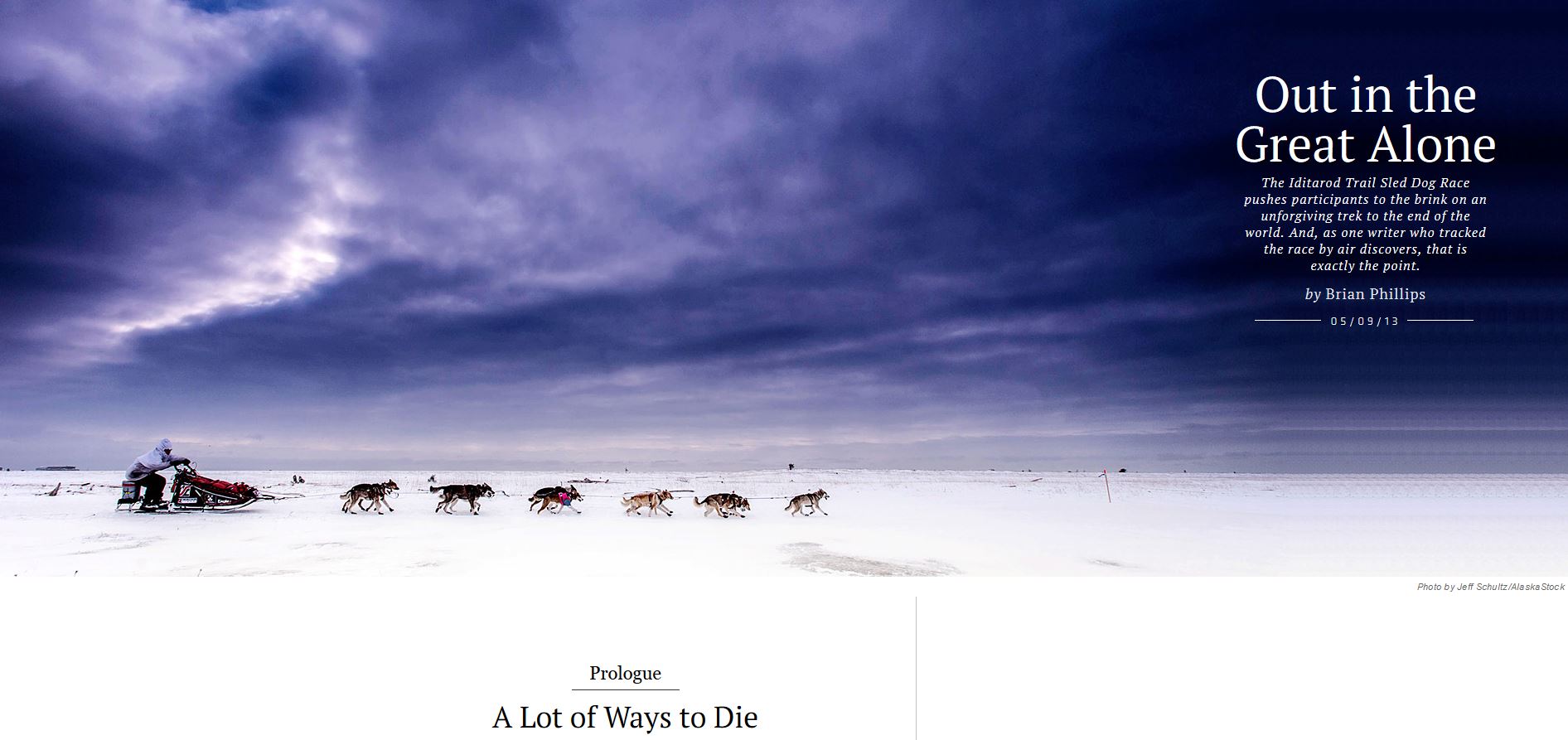
And to end with something a little closer to home, here’s ESPN’s project on the Iditarod. If you were to pick one of these ten projects as a goal or template, this project is probably one of the most attainable. But, it’s also gloriously elegant. ESPN did a really good job with this one, keeping the elements simple but useful. Each piece of information or graphic that sits outside of the story text serves a purpose and don’t overwhelm the story. Small snips of sidebar information are tied to references in the story with subtle color so the user realizes that an obscure point (for non-Alaskans) is explained more fully to the side. The chapters are broken up by large, beautiful photos and smaller ones are spread throughout the piece’s sidebar along with a few videos. When you start exploring the story, you’ll see that it’s clearly written for outsiders and covers a lot of the novelty that the race has for lower 48’ers, but it’s beautifully done.
[/two_col_75_25_col1] [two_col_75_25_col2] Out in the Great AloneESPN | Grantland
May 2013
[/two_col_75_25_col2]
[separator type=’normal’ color=’#0f4447′ thickness=’1px’ up=’20px’ down=’20px’]
I’d love to hear what ideas you want to try out. Have a story like one of these? Send me a link, I’d love to see it.